essay
What I learned from building the first Ledger
I wanted The Dawson Ledger to feel like a place worth entering. Writing, art, mathematics and code would belong together, with paths between them that rewarded curiosity. The site itself became part of the experiment: could the way ideas were presented help a reader see their relationships?
Working with AI let me develop that question in several forms at once—an essay, an image, a visual experiment, a piece of software. The Ledger was a personal creative project. It did not need to become a business to justify its existence. That freedom made room for decisions whose value was in what they helped me explore and make.
The first design was unusually elaborate. Looking back, I want to preserve the intentions that earned that effort and make them easier for another person to encounter. The images below preserve a few of its rooms and doorways as part of that story. Three decisions explain much of the project: giving the writing a setting, connecting across subjects, and making the collection visible to its own author.
Give the writing somewhere to live
The original design essays described a blue Library, an amber Drafting Room and a violet Workshop. These rooms stood for contemplation, building and transformation. The interface also gave art its own Gallery. Their colours, images and transitions made different kinds of work feel like neighbouring places.
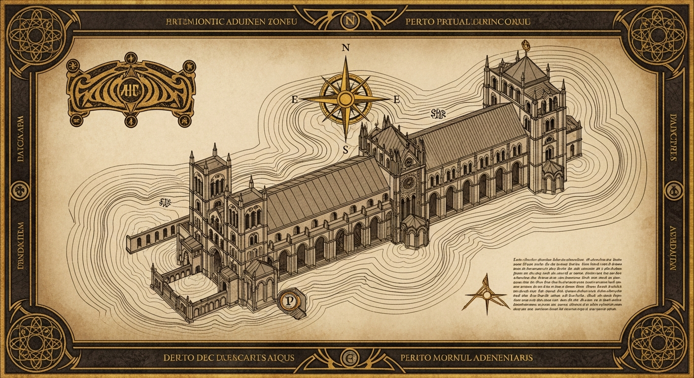
The map made an unusual promise for a personal blog: there would be somewhere to wander. Its “Attunement Lens” invited a visitor to explore the collection through a pattern—the kind of relationship an essay explored—or a domain, its subject. The drawing supplied the atmosphere; the controls gave the metaphor a practical use.
Four ways in
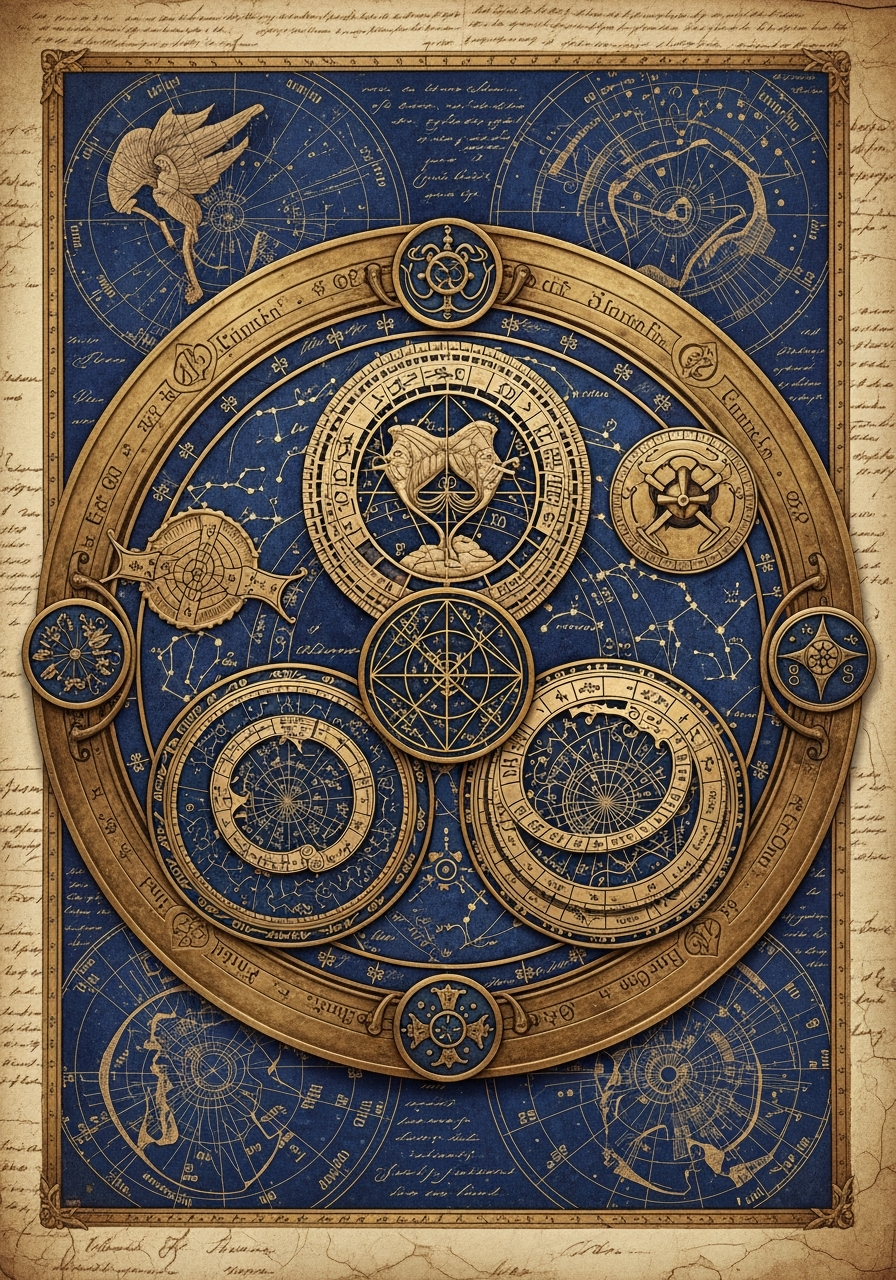
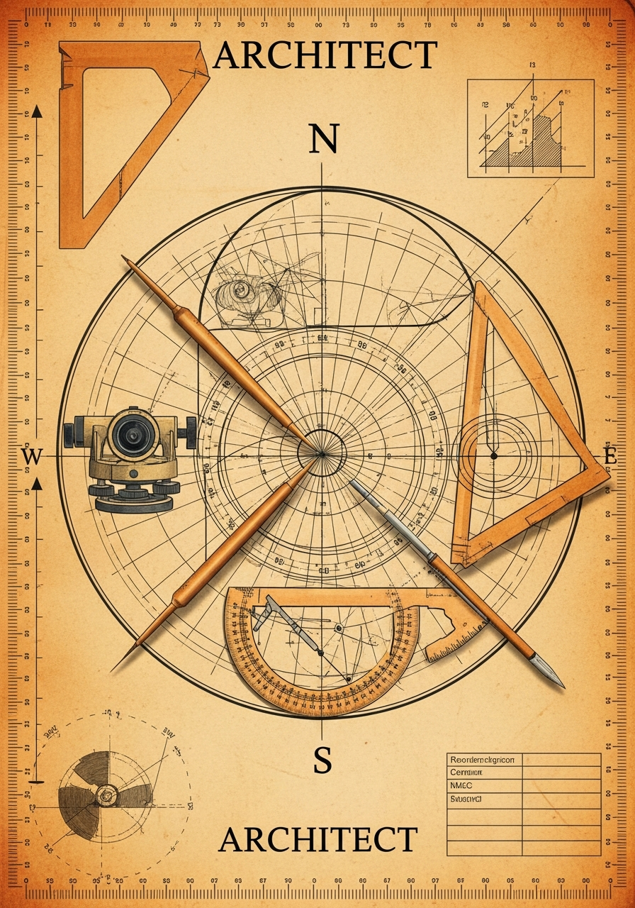
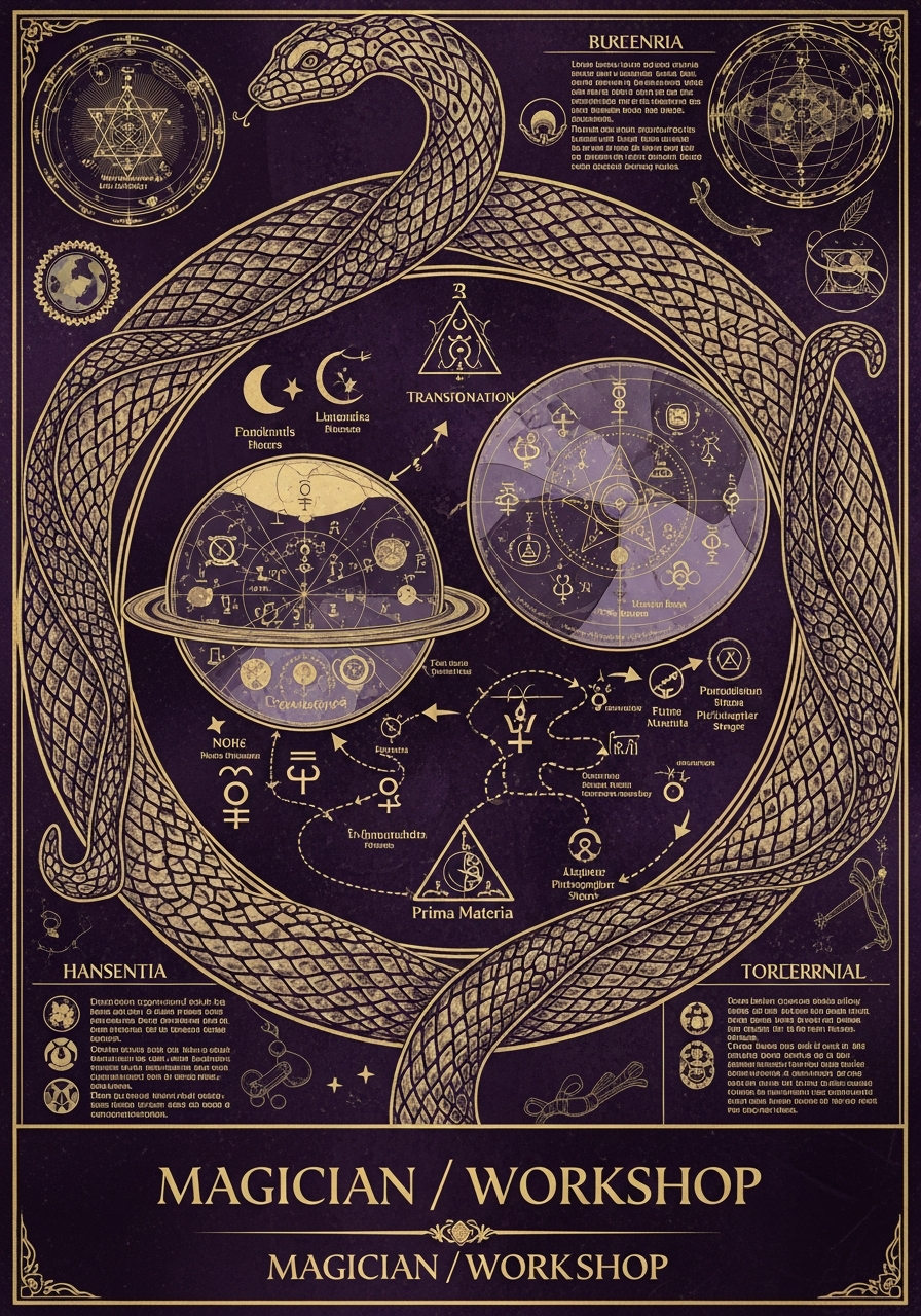
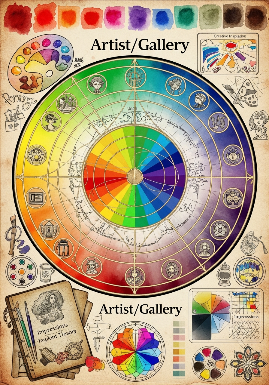
These are the original interface artworks, preserved whole. They share parchment, fine geometry and luminous colour, yet each has a different centre of attention. They can live here as a record of the first design even if the four-hall navigation does not return. A visitor need not learn an old menu to enjoy what it made.
I used the language of a cathedral because I wanted coherence, beauty and care to extend through the whole place. That ambition still matters to me. A painting can invite someone into a difficult essay. Colour can hold different interests together without making every page feel identical. A quiet reading space can give an argument room to unfold.
The useful test is what someone can do on arrival. Can they find the essay, understand its subject and begin reading? The room can have character while the door has a clear label. Names such as Sage, Architect and Magician belonged to my working vocabulary; a visitor should be able to enjoy the result before learning that vocabulary.
That is a design problem worth keeping: how much atmosphere helps a person settle in, and where does it begin to ask for attention the writing needs?
Build paths between interests
Resonance was the central discovery idea. An essay about institutions might lead towards incentives; a mathematical image might open a question in philosophy. The relationship could come from a shared problem even when the subjects used different language.
The first technical blueprint tried to express this preference in its connection rules. It gave a shared pattern more weight than a shared subject, while also favouring essays in the same series. That choice tells us something useful about the design: continuity mattered, but crossing a subject boundary was part of the invitation.
The old system also named connections after musical intervals. Those names gave it character. To help a reader, the relationship still needs an explanation. A link might say that two essays examine what survives when something changes form, or that one challenges the other’s account of responsibility. That sentence makes the next step intelligible.
The enduring work is finding and explaining such crossings. The companion essay, Resonant patterns, develops that practice through a painting, data compression and a historical object. It takes one of the first Ledger’s ambitions and gives the reader something concrete to try.
Let the collection teach its maker
The original Cathedral Mirror offered a different kind of picture: the writing itself became the subject. Its interface included a three-dimensional arrangement, a network of connections and views summarising the collection. In the arrangement, an essay became a point with a position; in the network, attention shifted to the lines between works. It let the author step back from individual essays and inspect the collection.
That change of scale can be useful. If I keep finding examples of integration—parts becoming a whole—am I giving enough attention to disagreement or separation? If an essay sits apart from the others, is a connection missing, or does it deserve to stand alone? The display can prompt questions that are harder to notice while editing one page.
The descriptions were not identical. The 243 Positions described patterns, subjects and three perspectives: understanding, construction and change. The surviving Mirror interface instead labels its three axes Pattern, Domain and Tier; tier places work at Foundation, Pillar or Roof. The essays and the interface record different versions of the experiment. Both suggest a useful writing prompt: approach a familiar topic from another position. An empty space can invite a question without becoming an assignment to fill it.
This is the role I would preserve for a Mirror: helping me examine habits, repetition and neglected questions. The categories are choices made for this collection. A network drawn from them can reveal consequences of those choices; it cannot independently establish a universal structure of knowledge. These are lessons from the first design, rather than a description of a rebuilt Mirror now available in V2.
Leave the reader room
The older essays called the hope behind attentive reading formation: an encounter that changes how someone sees or acts. I still care about that possibility. It gives a personal publication a purpose beyond accumulating visits.
The distinction is between making space for reflection and claiming to measure its result. A reading log can show what someone opened or finished. It cannot establish what they understood, rejected or carried into their life. The Unfinished Spires, the closing essay of the original design series, acknowledged that limit itself.
A visitor may find one useful paragraph and leave. Another may follow an entire series. The design should welcome both. Its task is to make the work available, offer worthwhile continuations and let the reader set the pace.
Keep the experiment, simplify its upkeep
The first blueprint asked a question that remains useful: what can be removed without losing the essence? For this project, the essence includes the writing, the artwork, the unexpected connections and the freedom to make things with AI.
The V2 approach separates the publication from the machinery used to prepare it. Writing and editorial work can develop privately; the public site presents the work ready for readers. This makes room for ambitious experiments without requiring every experiment to become something the whole site depends on.
Some of that machinery can become material for the publication. The four doorways belong here as an illustrated memory of how the site welcomed people. The map preserves the ambition to make exploration spatial. The Mirror belongs in the design history as a way of looking back across a body of work. Their value can outlast their role as working features.
The same applies to the older names and code. “Resonance” records an attempt to connect across subjects; “formation” records a hope about reading. Keep those ideas beside a clear example of what they meant. Selected code could later accompany this account where it lets someone try a useful technique. That companion remains a possibility, not a repository being offered here.
The earlier essays remain part of the record. They show how a personal purpose, AI-assisted making and a coherent visual language could produce something larger than a collection of posts. This account gives the best of that experiment a place in the new Ledger.
The Architect’s Workshop explores the philosophical commitments and AI-assisted making behind the Ledger. Here the lesson is a design one: give each part a useful job. Let the art invite attention, the essay develop an idea and the connection open another question. I want the place to keep its wonder while becoming easier to read, maintain and carry forward.
Sources
- The Cathedral Blueprint: A Technical Confession
- The Question Nobody Asked
- The 243 Positions
- The Unfinished Spires
- The Mirror’s Teaching
Interface and artwork record
The five images above are unchanged artwork files from the original home page and map, inspected on 1 October 2026. Interface descriptions were checked against the Cathedral Mirror on the same date. These are historical examples, not V2 navigation or a claim that those features have been rebuilt. The captured files did not establish an individual artist or generation model.