visual
Learning to look
View full artwork →
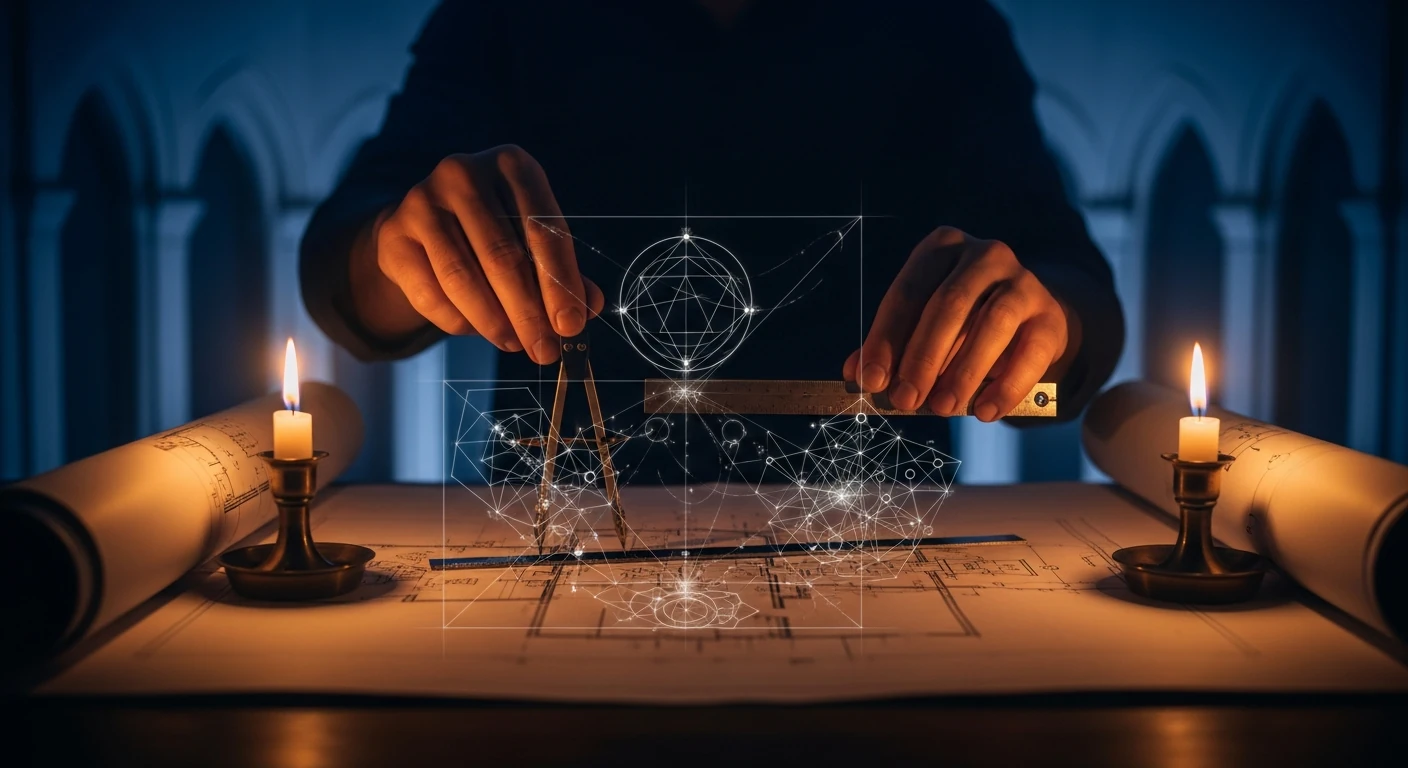
Two candles, a pair of hands, a blue room. The illustration for Technology as liturgy makes the act of making feel worth attending to. Before explaining it, pause over the picture. Where does your eye go first? What becomes visible when you stay?
Those questions offer a way into colour and composition: the arrangement of things within an image. Begin with what you see, consider what it suggests, then imagine changing one part.
Colour gives attention a direction
Amber light gathers around the hands, paper and candles. Deep blue fills the arches behind them. Against the figure’s dark clothing, fine white geometry becomes especially bright. A small number of colours gives the scene range: warmth near the work, coolness beyond it, darkness that lets delicate lines stand out.
One hand holds a compass; the other a ruler. Their solid presence gives the floating geometry something to meet. I read this as an idea taking form through the patience of craft. The interpretation begins in visible choices: tools, plans, working hands and the contrast between material objects and weightless lines.
Imagine the desk under even daylight. The tools remain, but the work might feel more ordinary and less secluded. Changing the light changes the emphasis. It makes the candlelit version’s contribution easier to see.
A palette acquires meaning through relationships within a particular picture. Blue need not always mean contemplation, or gold holiness. Here their contrast gives the subject a setting that feels both intimate and open to something beyond the room.
The detail that carries the idea
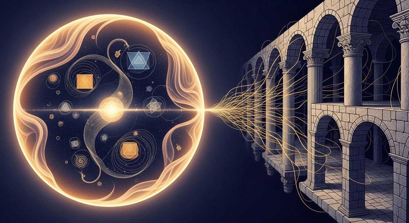
In this image, the sphere’s curves and the building’s repeated divisions give the two sides different characters. Golden threads cross between them.
With the title in mind, I see a possibility becoming a structure. Remove the threads in your imagination while leaving the sphere and arcade in place. The scene becomes more like two objects placed beside each other. The small crossing had been making a larger relationship visible.
This is useful when making images with AI. A beautiful result can contain many impressive details. Selection asks which of them serve this particular thought. Sometimes one well-chosen relationship carries more than another layer of ornament.
Let a line reveal a relationship
A mathematical plot gives us another way to look. The interactive study on Connections draws a curve from two repeating motions, one horizontal and one vertical. Each follows a sine wave: a smooth oscillation that repeats. The horizontal motion makes three cycles in the time the vertical makes two. The complete curve is shown at once; changing the timing changes its shape.
The result is a Lissajous curve. Its shape depends on the frequency ratio and on phase, the relative timing of the two motions. The control keeps the ratio at 3:2 while changing that timing. You can see the effect without having to infer it from a finished picture.
At 0° both coordinates start at zero. Move towards 90° and the horizontal motion starts a quarter-cycle further through its oscillation. The line changes shape although neither frequency has changed. The same ingredients can form a different relationship when their timing changes.
In the code, this is a small construction: calculate the horizontal and vertical positions for successive moments, then join them with a line. A browser can draw and vary it directly. Its usefulness lies in how clearly a reader can connect the setting, the rule and the result.
A similar ratio describes a perfect fifth in just intonation, a system of musical tuning using whole-number ratios. That is a mathematical connection we can specify. If the curve also reminds you of a flower, a window or a woven form, you have a visual comparison to explore. The resemblance does not tell us that those things were produced by the same process.
Try the interactive study on Connections
Leave something to look at again
My interest in visible form has a Christian foundation. The Incarnation—the Christian claim that God became human in Christ—gives embodied life profound weight for me. I care about whether an idea finds a form that honours what it means.
These illustrations have their own modest purpose. They can bring an essay into view, give a relationship a shape or make someone want to stay a little longer. A picture can remain mysterious after careful looking.
Choose a detail, say what you see and imagine changing it. Then return to the actual image. The exercise should sharpen the pleasure of looking, not use it up.
Further reading
- MIT: Lissajous figures and repeating motion.
- University of Michigan: frequency, pitch and musical ratios.
- John 1:14, the scriptural starting point for the reflection on the Incarnation.